Creating the Brand
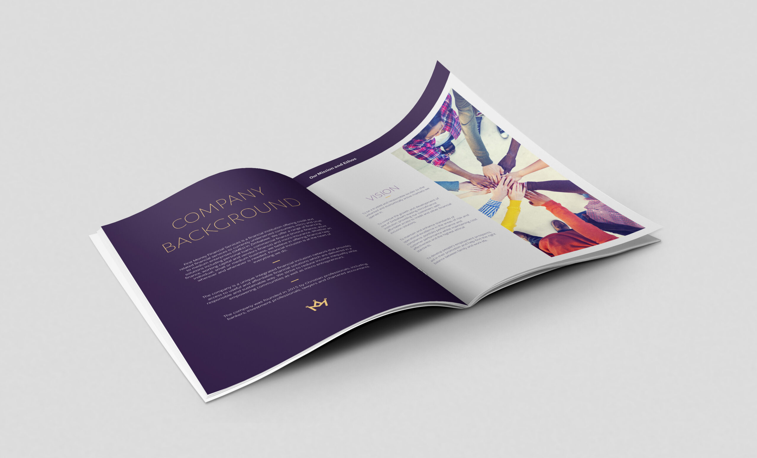
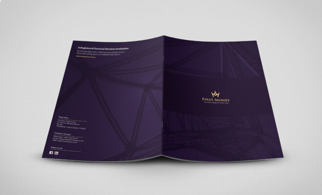
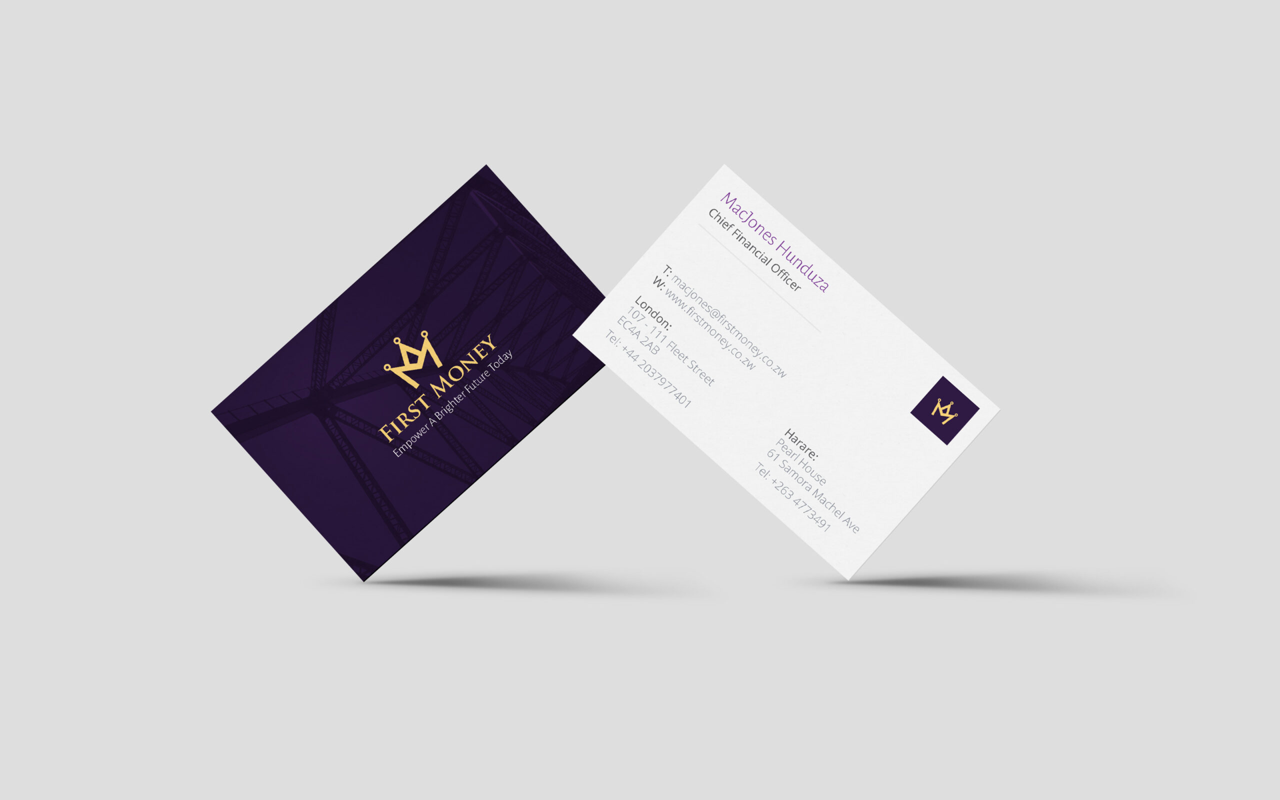
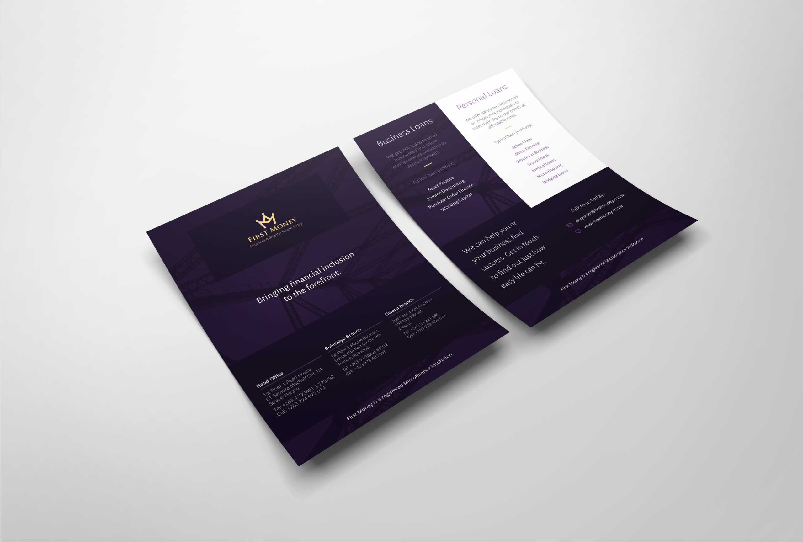
First Money came to us with an existing logo that was fine, but there was a lack of cohesion in their materials and no emphasis on having a strong brand overall. We refreshed their look and feel, making it more modern and professional, while still remaining true to their target audience. This helped them appear more credible and although the brand needed to be corporate, it had to appeal to regular African people, so we were careful not to go so far as to alienate their audience.
The brand, we felt, needed to be authoritative and strong but also approachable. Making sure to avoid similar styles to our researched competitors, we opted for a regal purple to complement the existing brand mark along with gold accents throughout.

